
Quite some time ago, surfing the net, I found a gem named ‘Scale of the universe 2’. It is an amazing tool that allows you to visualise the incredibly huge disparity of sizes known to man. From the Plank length (1,6·10-35 m) —”the smallest distance about which current experimentally corroborated models of physics can make meaningful statements” [1]— to the diameter of the observable universe (8.8·1026 m). And in between, all you could imagine. A range of more than sixty orders of magnitude! You want to compare the Eiffel tower with the Titanic? No problem. You want to compare it to the Halley comet? Just use the scroll. It is beautifully intriguing. You can spend hours and hours scrolling and discovering endless information.

This is an amazing tool which I keep on visiting from time to time, especially when I read or hear about huge or tiny sizes and I need to get an idea on where they fall. It makes interactive what the classic video ‘Powers of ten‘ showed already in 1977. Since then, other videos show more or less the same. But still, with the tool you can discover at your own pace or try compare what you are interested about.
I have always found it very interesting to be able to visualise in some way the magnitude of the things which are outside our day to day, outside our scale; to give them a context and place them in a general frame. But this is not always easy. For example, 10.000.000.000.000.000 is the same as 1016. Do you get an intuition of the magnitude of the number? I don’t really. The scientific notation at least makes it is easy to compare and operate with numbers of distinct scales, but intuitively the difference between 1016 and 1011 is not large, and yet there is a 100.000 fold difference.
Another “tool” that can help us place anything in a general frame, in this case in a temporal frame, is what is called ‘Big history’. Here you can see the Ted talk with which I discovered it. It is very interesting:
The guys from the ‘Big history project‘ have prepared a history course which is a bit special. This course starts a bit earlier than the typical history courses. It starts 17.3 billion years ago! They offer a course that can be taught in schools and also a MOOC (Massive Online Open Course) in coursera.org. Since this project started, other institutions have also developed similar courses. I did a couple and they are fascinating! I recommend everyone to give them a try. They review the most important events of the history of the universe in an ordered and visual way. They start with physics and chemistry —with the beginning of the universe, the formation of atoms, stars, galaxies and planets—, then they continue with geology and biology —formation of Hearth, the evolution from uni-cellular to complex life—, and finally they end with (“normal”) history and sociology —appearance of the sapiens, conflicts and relations between humans—. They show how local increases in the universe’s complexity has led to us thanks to some delicate goldilocks. Here you can see (and download it as a 16 MB pdf file!) the timeline produced by the ‘Big history project’.

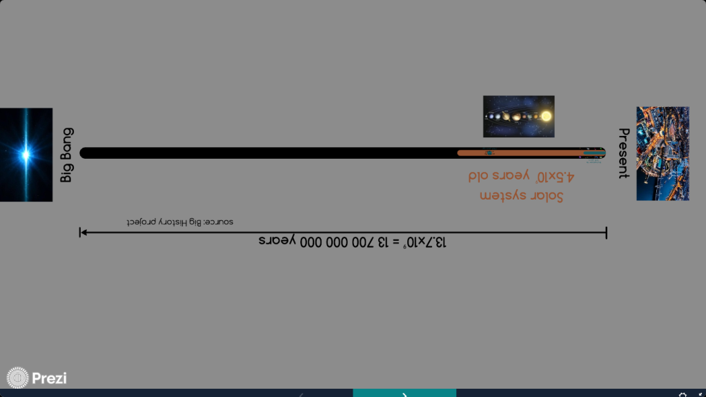
That’s again super-interesting and informative. You can easily ‘navigate’ through the whole history of the universe easily and with huge detail. The only problem is that the time axis is not lineal. This makes it is difficult to really get an idea of the real temporal scales. This scale can obviously not be lineal because the pace of relevant events increases exponentially when it gets closer to the present. But, what if there would be something similar to the ‘Scale of the universe 2’ but showing time scales instead of space scales? I had searched several times for such a tool but I was always unsuccessful. That’s why some years ago I tried a quick and dirty attempt to it. Curiously, I managed to obtain a pretty descent result using Prezi, the presentations software —I actually used the old version of Prezi; I don’t think it would be possible to do it now, but it still works and can be edited!—. I’m sure the creators of Prezi did not anticipate its tool would be used in such a way. What I did is a simple presentation with only a handful of events placed in a kind of an arrow of time. The beauty of using Prezi is that it actually allows you to zoom in and out at factors of 10. This let’s you actually place the events following a linear distribution. So, instead of using a logarithmic time axis to be able to properly place each event, it allows you to zoom in and out and place them in a linear axis. It is the same approach used by the ‘Scale of the universe 2’. The result is not awesome but allows you to easily visualise the most relevant “big-historical” events and compare their hugely distinct temporal scales. That’s enough description, just take a look at it!
I hope you like it; I am actually proud of what I did. However, I’d still love to have some kind of tool similar to this but much more professional, letting you navigate through all the events showed in the infographic above. This is why I wrote this post. Maybe someone with the skills and patience to do it sees it sometime and decides to go for it… Let’s see! Please, if you do, don’t forget to comment below and show me the result!
That’s all for today, stay safe!

That was resourcrfull and interesting! Thanks for your time in that work
Happy to see you liked it 😊